A Guide For
Designers
Get your artwork right first time by following our detailed explanation of the process and specifications. If you're a complete novice you may want to look at our Novice Guide
Essentials
Here are the essentials. Get these right and you should be fine.
Get it right first time!
- We can accept artwork as PDF, Photoshop, InDesign, or Illustrator files.
Ideally, you should send both PDFs and native files. - All images must be at least 300ppi.
Images with fine lines or small text should be 600ppi or vector, and 1bit images should be 1200ppi or greater. - Logos or line art are best as vector.
Or as 1200ppi 1bit images. - Colours should be CMYK or greyscale.
If spot colours are used then these should be indicated. - Send all of the fonts that you have used.
Please zip or stuff the fonts to avoid corruption. - Text should be at least 5pt
7pt if the font is light or white on a dark background. - Do not leave template lines on top of the artwork.
Unless it is in an editable format. - Do not mark centre holes on vinyl or CD label artwork.
Remember that there will be holes but do not mark them. - Mark all relevant information on the pasteboard or in an area outside of the bleed.
For instance page numbers, spot colours or special instructions. - Clearly name your files and include the catalogue number.
This is important if you are sending the files via ftp or email, so they are easy for us to locate. - Please confirm if you plan to print on uncoated paper or reverse board.
Uncoated paper or reverse board (rough finish) require different maximum ink levels and minimum type size to standard paper or board, and colours may appear less intense. - All artwork must be proof read before it is given to us.
We cannot be held responsible for proof reading or spelling errors. - IMPORTANT! From January 2023 Adobe will no longer support Type 1 PostScript fonts in InDesign, Photoshop or Illustrator.
Please ensure you use OpenType fonts to avoid any printing issues in the future.
When you have finished your artwork, print it out and assemble to make a mock-up of how it will look when printed. This will give you the chance to double check your artwork before you send it to us. Give your print out to the three most fastidious people you know - they might spot some mistakes that you haven’t noticed. It is better to find the mistakes before you print hundreds or thousands of copies.
How to Send Your Artwork
There are a number of ways to send your artwork to us.
Filesharing
You can use a filesharing website such as the free WeTransfer.
Please make sure to send the notification to the Account Manager who sent you the artwork templates.
FTP
FTP software is needed to upload files to the Key Production ftp server.
If you are using a PC then you can use Filezilla or Core FTP which are both free to download.
If you are using a Mac then you can download a free trial of Fetch.
All of these programs come with instructions.
Please inform the Account Manager who sent you the templates when your artwork has been uploaded.
The Key Production FTP
ftp.keyproduction.co.uk
Use the ANONYMOUS option (no password needed).
Upload your artwork into the INCOMING folder.
File names must only use letters, numbers, underscores and hyphens. Do NOT use special characters as it will prevent your file from uploading.
Your Proofs
We will endeavour to make your product to the highest standards. We know your release is important to you and it's important to us that your completely satisfied with the end product. Within a few days of receiving correctly set up artwork we will send you a set of PDF proofs.
It is important that you check your proofs very thoroughly as it is your last chance to make sure that everything is correct before your release is printed. The PDF is not for colour approval due to variances in screen settings and resolution.
If you notice anything that is incorrect then please let your Account Manager know immediately. If you are happy with your proofs then email your Account Manager to let them know that you are ready for us to proceed with printing. Production will not start before your approval.
What To Check For
- Positioning.
Is everything in the right place? - Barcode.
Is the barcode the correct number? - Spelling.
This is your last chance to spot any howlers! - Labelling.
Are the page numbers marked up correctly? Are the vinyl label sides correct? - Fonts.
Do all the fonts look as they should? - Overprint & knockout.
It is very important that you check your proofs thoroughly as it is your last chance to make sure that everything is correct before your release is printed. - Overall look.
Does it look how you expected it to look?
To view overprint you must use the Adobe Acrobat Reader DC, download it for free at www.adobe.com. In Adobe Acrobat preferencers go to Page Display then choose Overprint Preview.
Barcodes
Some shops or distributors may insist a barcode is included on your artwork.
The barcode box should be at least 32mm wide and 10mm high and there must be a clearing space of 3mm either side of the edge of the barcode. Barcodes should not be less than this minimum size.
If you would like us to place a barcode on your artwork then indicate the required position, leaving a space of at least 32mm x 10mm for us to place your barcode. We recommend a black barcode on a white background, preferably vector art or 1200ppi and single colour 100% black.
If you choose to have a colour barcode then it's important understand that some colour combinations will not be read. Be sure to adhere to the below acceptable colour combinations if you choose to have a colour barcode.

These barcodes WILL read.
These barcodes will NOT read.
Putting pages in order
Booklet artwork should be supplied set out in printers pairs as illustrated below.
Printers Pairs

It is not always obvious to us what the page order is! Please help us by marking the page numbers on the pasteboard or outside the crop marks, or supply us with a print out of your booklet, with page order clearly indicated.
Bleed and borders
When printed parts are trimmed to the correct size there is a chance that the cutter will shift slightly. Most printers have a cutter tolerance of 3mm. This means that the cutter could cut 3mm either side of the crop line. In practice it is rare that the cutter is out by more than 1mm. By adding bleed (extending images and background to extend 3mm all around the edges of your artwork), keeping text in the safe area (3mm away from the edges) and making borders at least 6mm means that it will not be noticable on your finished print if the cutter trims the artwork slightly off the trim line.
Bleed and Safe Area
Bleed is the area outside the trim line that will be trimmed off when finished. It is usually 3mm but may be more. It will be indicated on the template supplied to you.
The safe area is 3mm inside the edges of the artwork. You need to keep all text and important graphics within this area.

In the illustration above the dotted line represents the bleed of 3mm added all the way around. The solid line represents the crop where the finished print will be trimmed. The grey area indicates the area within 3mm of the crop line; don't put text in this area.
Borders
Borders should be at least 6mm thick to avoid the risk of looking uneven when the finished print is cropped.

Image Resolution
All images must be at least 300ppi. We recomend that images with fine lines or text should be 600ppi. Bitmap images should be at least 1200ppi.
If images have a lower resolution than recommended there is a danger that the quality of the finished print may not be as good as expected.
Remember that if images are placed into a layout program such as InDesign or Illustrator at more than 100% then the actual resolution will be lowered. For example, if an image is 300ppi and then used at 200%, the actual resolution will be 150ppi.
Images in Adobe Illustrator
In Illustrator the colour mode and PPI can be seen on the top bar when the image is highlighted as shown in the screenshot below. Open the the Links palette for further information on all the images used in the document.

Images in Adobe InDesign
If you are using InDesign, use the Preflight function to check if the images you are using are of a high enough resolution and are CMYK or greyscale.
Window > Output > Pre-flight > Basic Working Profile
Ink Coverage
It's importat to be aware of the limits of ink coverage. Having high levels of ink that exceed the printers maximum coverage may make it impossible to print your product.
Maximum Ink Coverage
Printers are unable to print items where the ink is too dense.
The total maximum ink coverage for standard stock (paper) should be less than 320%. This means the CMYK value of any colour used should not add up to more than 320%. If part of an image includes dark areas with values that add up to more than 320% then the ink level is too high.

The area in the centre above adds up to ink levels of 360%; too much to print.
Minimum Ink Coverage
If your artwork has areas that have very light colours then there is a possibility that the ink will not print. Ink coverage should be over 4% for cyan, magenta and black, and over 10% for yellow.

The percentages circled in red are the minimum ink levels. Any lower and the ink may not show when printed.
This is a general guide and in some instances these amounts may differ. If you are using uncoated stock or reverse board then the maximum ink levels will be lower - please check with your Account Manager for details.
Increasing and Decreasing Ink Levels
If you have been told that areas are below the ink level limits then you will need to look at the lightest areas of your artwork and adjust them accordingly making them denser.
If you have been told that your artwork has ink levels that are above the limits then you need to look at the darkest areas of your artwork reduce the density of the ink.
Spot Colours and Varnish
Careful use of spot colours, spot varnishes or foil blocking can really make your finished design really stand out. If you are supplying your artwork in Adobe Photoshop then please use a separate, clearly indicated layer for the parts of the artwork which will be printed as pantone or have a special varnish or foil block.
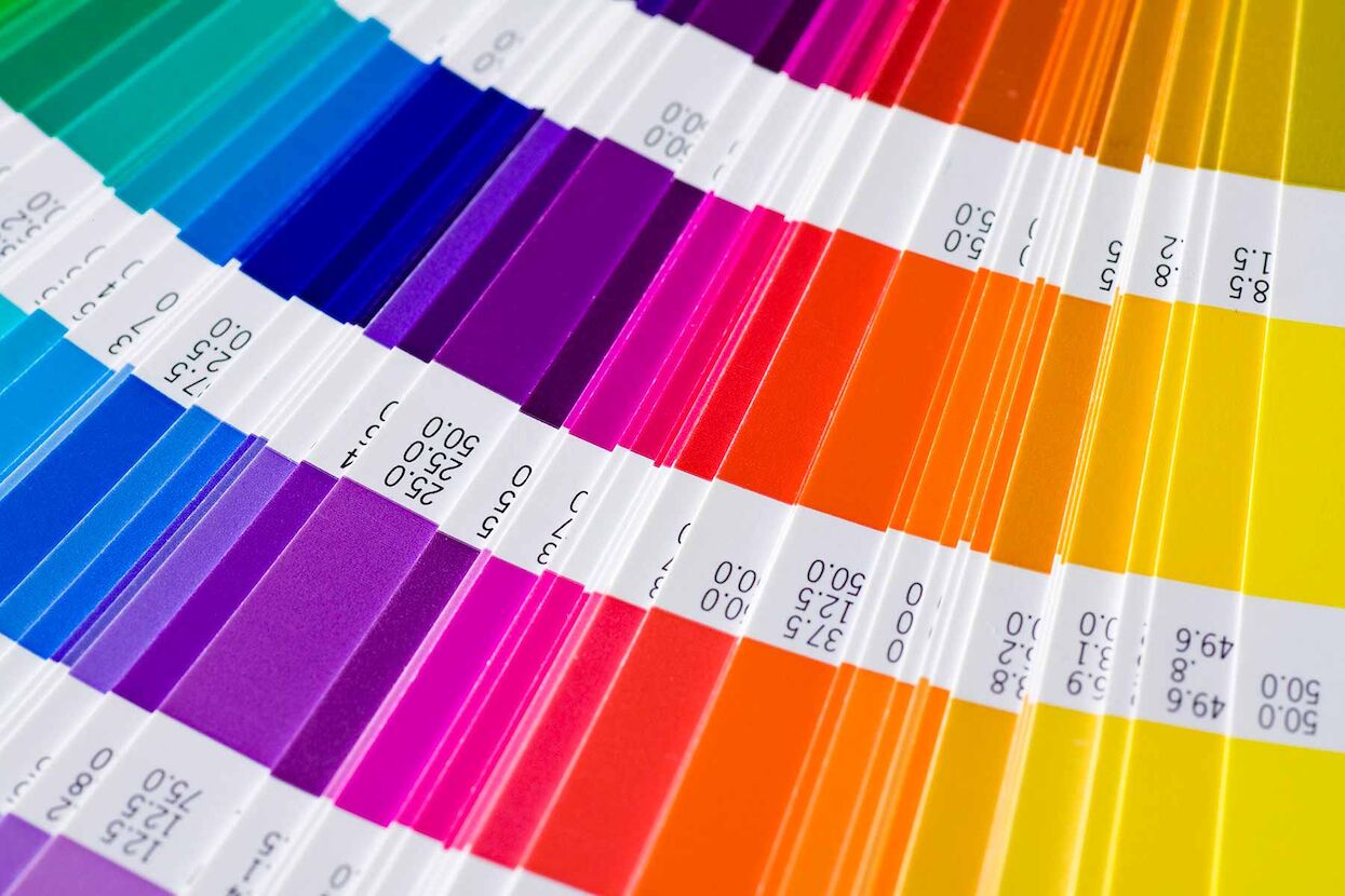
Pantone Colours
Pantone colours (also called spot colours) are specific coloured inks, some of which are fluorescent or metallic. If you would like a very bright colour then you might wish to use a fluorescent pantone.
If your design includes some special spot colours (this could be a bright fluorescent green, a specific shade of red, or a metallic gold), or you would like some parts of your artwork to appear more glossy, then please indicate the pantone reference number of the ink.
Beware of using metallic pantone inks on record labels, as the manufacturing process can distort the finished effect.
Spot Colours in Photoshop and Illustrator
If you are supplying your artwork in Photoshop then please use a separate, clearly indicated layer for the parts of the artwork which will be printed as pantone or have a special varnish or foil block. If you are using InDesign or Illustrator then please colour up the parts using the program colour swatches or use a separate layer and make a note regarding this on the pasteboard.

Spot Gloss and Matt Varnish
Care should be taken with the space between varnished areas. Spot UV is more viscous and has a tendency to spread and so fill in. Line work should be more than 0.5pt, anything less than this will not print.
- Varnish artwork is best supplied as vector but may be supplied as a 1bit image of at least 800dpi.
- Varnish artwork should be set up as a spot marked up as SPOT UV MATT VARNISH or SPOT UV GLOSS VARNISH and set to overprint.
- Be aware that it is difficult to achieve 100% accurate registration with this process so some movement should be expected.
- Type should be as large and bold as possible. The recommended size is 14pt, light fonts will need to be larger.
- If varnish is applied over fold or creases then it is likely to crack and flake.
- Cost will vary depending on the intricacy, finish and area covered so finished artwork will be required before a final quote can be given.

Embossing, Die-cuts and Foils
Emboss is where an area of the print is raised. Deboss is where an area of the print is recessed. Die Cutting and Laser Cutting involves cutting out an area of the card or paper to leave a hole. Foils added to the print surface by heat and pressure.
Embossing and Debossing
Artwork should be supplied as vector and set up as a spot marked up as Emboss or Deboss and set to overprint.
- Linework should be a minimum of 1mm.
- Certain types or weights of board are not suitable for embossing or debossing, please check requirements with your Account Manager.
- Beware that it is problematic to have 100% accurate registration with this process so some movement may occur in the lining up.
- These are rough guidelines to help you set up your artwork. Advice can be given on individual jobs.
- Cost may vary depending on intricacy, finish or area of process so finished artwork will be required before a full quote can be given.

Die Cuts and Laser Cutting
Careful consideration should be taken in to the practicalities of the design.
- Cut out areas should not be too fine or large.
- The design should not be too intricate.
- Care should be taken to avoid parts likely to catch and rip easily.
- There should be a minimum of 3mm between cutouts.
- The cutter guide artwork should be supplied as vector and set up as a spot marked up as Cutter and as overprint.

Foils
Generally, foils are metalic sheets applied to a print surface using heat and pressure to create gold or silver areas, but are now available in an increaing range of materials including mirror and hollographic effects.
- Foil artwork should be supplied as a vector and set up as a spot colour, marked up as Foil and as overprint.
- Type should be as large and as bold as possible. Recommended minimu size is 14pt, however, light fonts will need to be larger.
- Linework should be a minimum of 1mm.
- Be aware that it is difficult to have 100% accurate registration with this process so some movement may occur in the lining up.

Artwork for CD Labels
Designing for a CD or DVD onbody label is different to designing for paper. The way the design is printed on to the disc means that some designs work better than others. Look at some of the CDs in your own collection and think about what makes them good or not so good!
Please use the template supplied to you, do not change the size or layout of the template. Remember that there is a central hole, but do not mark this on your artwork. CD label artwork is different to paper print in that it does not need bleed. Remember to include a catalogue number on your artwork.
Images
Use images that are 600ppi. If you are using a design with a lot of fine graphic detail then it is best to use vector artwork (Illustrator eps) rather than bitmap images (Photoshop). Avoid subtle tonal shades and tints that are less than 15% or over 85% and gradients which do not print well on to discs. Due to specialist print techniques, inks and media surface it is not possible to colour match to paper parts.
Colours
CD onbody artwork can be set up as either full colour (CMYK) or using spot (Pantone) colours. When using Pantone colours please select colours from the Pantone Solid Coated library. For photographs or images with mid-tones it is best to set up as CMYK, even if the image is a black and white photograph. If you have a full colour design then it is recommended that a white base is also used. List the colours that you use at the edge of the template and indicate if you want a white base or not.
If the disc does not have a base colour then the silver of the disc will show though where there is white (or tones) on your artwork . The silver part of the disc does not go right to the centre of the disc, there is a ring around the centre which is clear plastic. Be aware of this if you are planning to have the silver of the disc as part of your design.
Text
Text must be bigger than 5pt. Small text prints better as 1 colour (ie single channel 100% black or a solid pantone colour). If using fine text or white out of coloured text then it should be bigger than 7pt.
For the best results make text vector. Text that is part of an image (ie done in Photoshop) may not print clearly and should always be at least 600ppi.
Inside or Reverse Print
Inside or reverse print can be added to card packaging so that there is print inside the sleeve which is usually left blank. It can be used on digisleeves or digifiles so that there isn’t the white strip on the inside spine of the digi.
Preparing the artwork
If you're supplying inside/reverse print please ensure the opposite side of any glue flap is covered with the required image or colour, they have bleed and are correctly orientated.
It's important to remember that ink will absorb in to the reverse side of the board more than the coated side of the board and will therefore look darker or duller. Ask your Account Manager about how this might affect your artwork.

Above image shows the print artwork for a 4 page digi file with the outside (left) and the inside/reverse (right).
Below image shows the inside of the finished digi file.

Artwork for Vinyl Records
Sleeves can be top opening or side opening. Most LP sleeves are side opening, and the inner sleeves are top opening, but you can choose to be different if you prefer. Please clearly indicate which you would like for your sleeve.
Side opening

Top opening

The Labels
The record label needs to be ‘baked’ when it is fixed on to the record. This means that heat is applied to the labels which can cause an alteration of colour. Be wary of using metallic pantone colours on labels. Please make sure that the label sides are clearly marked.
Designing in Photoshop
If you're working in Photoshop then you will have been supplied a PDF template.
Open Template
- Open the template
- Set Resolution to 600ppi.
- Set the mode to CMYK color.
- Click OK!
- Add a new layer on top of the template layer and use this for your artwork.
- Before you begin to assemble your design, please check that the size of the template is correct.

Setting Colours
It is important to design your artwork in CMYK rather than RGB. To print your design the images need to be CMYK. When images are converted from RGB to CMYK the colours often appear more dull. If the image uses spot colours (Pantones), a varnish or has a cut out, mark this on a separate, clearly labeled layer or chanell.
Blacks
Black can be just black ink or can be made up black with some cyan, magenta and yellow. Black which is just black ink will not be as strong as a rich black which contains cyan, magenta and yellow.
If you are using a lot of black in your design then make sure that the different blacks match. If you have blacks that don’t match then you could end up with unwanted boxes and lines on your artwork when it is printed. Mismatched blacks are very difficult to spot on screen, so it is important to check for mismatched blacks. You can easily do this by opening the channels palette and viewing each channel individually.
Checking Ink Levels
It's important that you check the ink levels in your design documents. To check the ink levels in Photoshop:
Open the info palette - Window > Info .
Click on the small arrow on the top right of the palette and select Info Palette Options.
Change the First Colour Readout to Total Ink, and the Second Colour Readout to CMYK Color.
Hold your cursor over the darkest parts of the image and check the Total Ink Readout.

Supplying Photoshop Artwork
When you have finished your design, you can send us your artwork in any of the following formats.
PSD: Supply either flattened or in layers. If in layers please supply fonts.
TIF: Save without compression, either flattened or unflattened.
PDF: Save at the highest quality, with no compression.
JPG: Save at the highest quality.
If you supply an unflattened file with the layers still in place please delete any empty or hidden layers. You must also include all the fonts that you have used and zip the fonts to avoid them corrupting.
If you have used spot colours or varnishes in your artwork these should be marked clearly on a separate layer. For more information see spot colours.
.
Designing in InDesign
Open the template supplied to you and work on the artwork layer or make a new layer for your artwork if needed.
Things To Check
- Fonts are included.
- All text is at least 5pt or 7pt for white out text
- All images used in the design are supplied.
- Image resolution is over 300ppi, 600ppi for fine detail and 1200ppi for 1bit images.
- Colours are CMYK.
- Colour swatches and images should be CMYK, greyscale or Pantone spot colours.
- Ink coverage is less than 320%.
- Pagination is correct.
- Bleed is included.
- Extra information is listed on the pasteboard indicating page numbers, label sides and spot colours
Use the Preflight feature, Window > Output > Preflight, to check the fonts and images.
Use the Package feature, File > Package, to collect all of the fonts and images used in your artwork.
Designing in Illustrator
Open the PDF template supplied to you in Illustrator and create a new layer to place your design on. Check that the colour mode is CMYK and not RGB. To print your design the images need to be CMYK.
Putting it Together
IMAGES
If you are placing images into your design then make sure that the images are at least 300ppi. Embed your images or send us the images that you used along with the Illustrator files.
FONTS / TYPEFACES
Send us the fonts used in your design, or turn the fonts to outline. To do this select all the type, go to Type in the top menu, and select Create Outlines. Avoid using cloud based fonts such as Adobe Typekit.
COLOURS
Make sure that all colours are CMYK or greyscale or spot colours if required.
If the image uses spot colours (Pantones), a varnish or has a cut out, mark this on a separate, clearly marked layer.
FILE FORMAT
You can supply your files as ai, eps or PDF.